Have you tried visiting the Furry Network site from a mobile device? You just might be in for a treat: the entire site is designed to work flawlessly with smartphones, tablets and mobile devices!
Here’s what the site looks like on an iPhone 6:
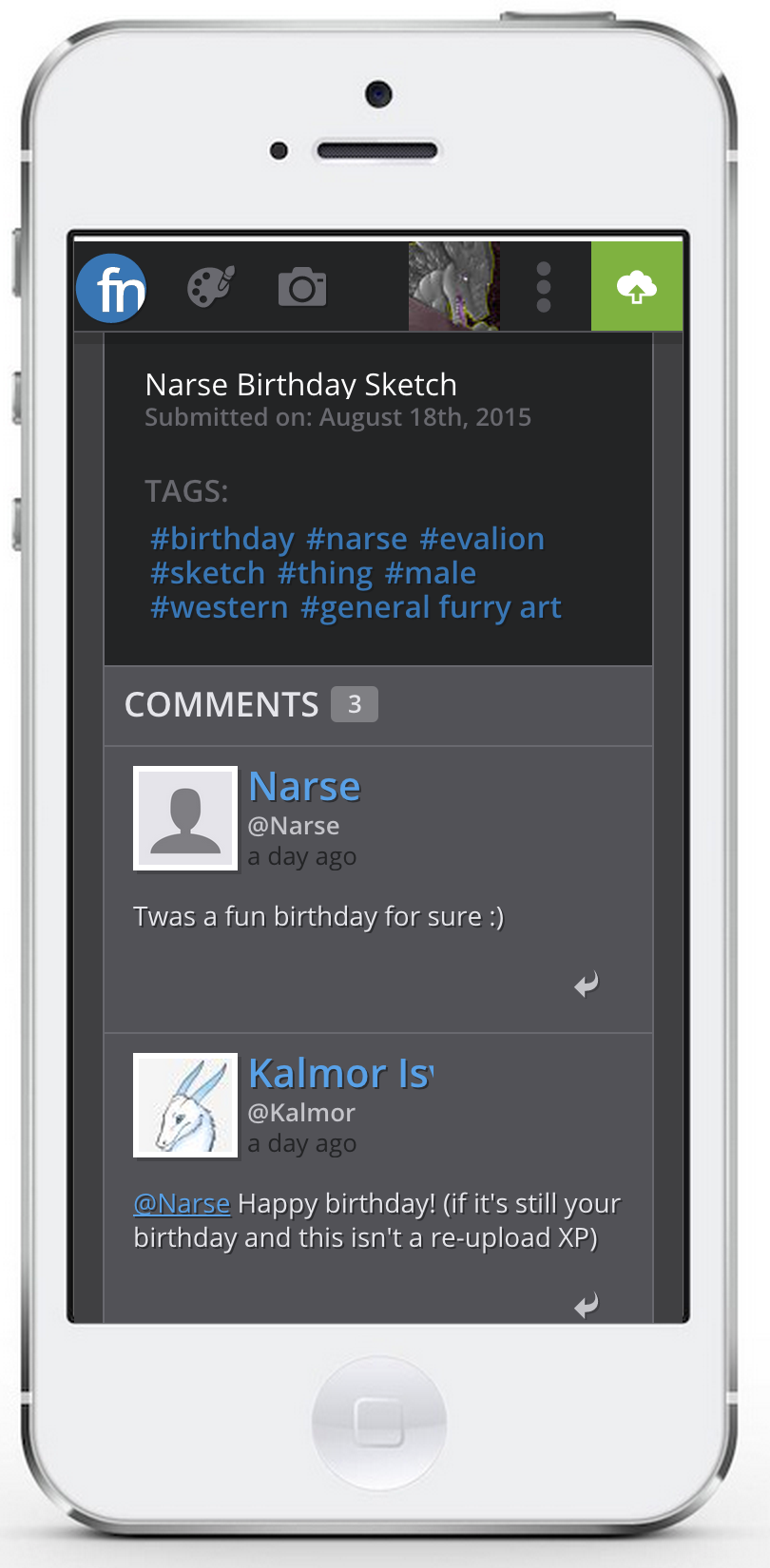
This isn’t a separate page or version of the website, and you don’t need to do anything to get this view. The website will automatically detect the size of your device (And its orientation – portrait or landscape), and adjust its layout accordingly. No features are lost – you can do absolutely everything from a mobile device, including signing up in the first place!
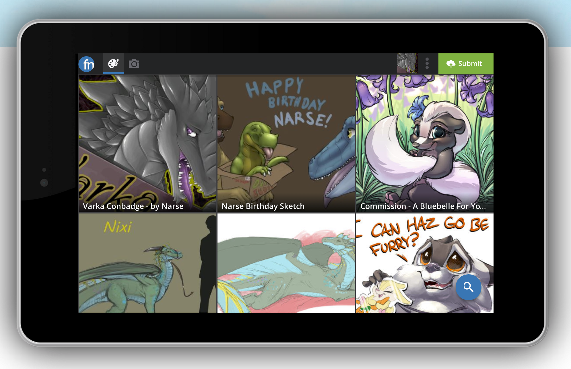
Here’s what it looks like on a Nexus 7 tablet:
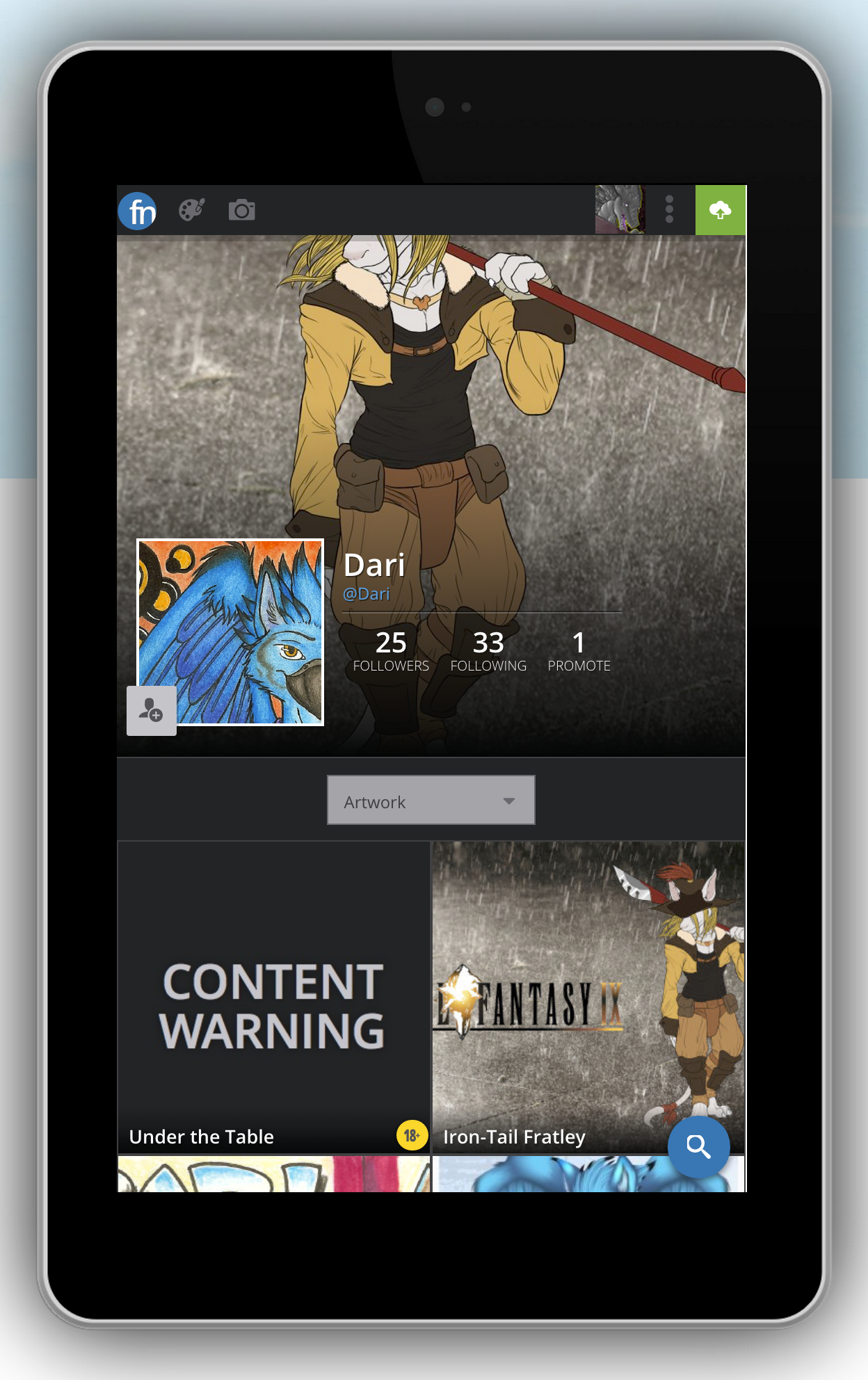
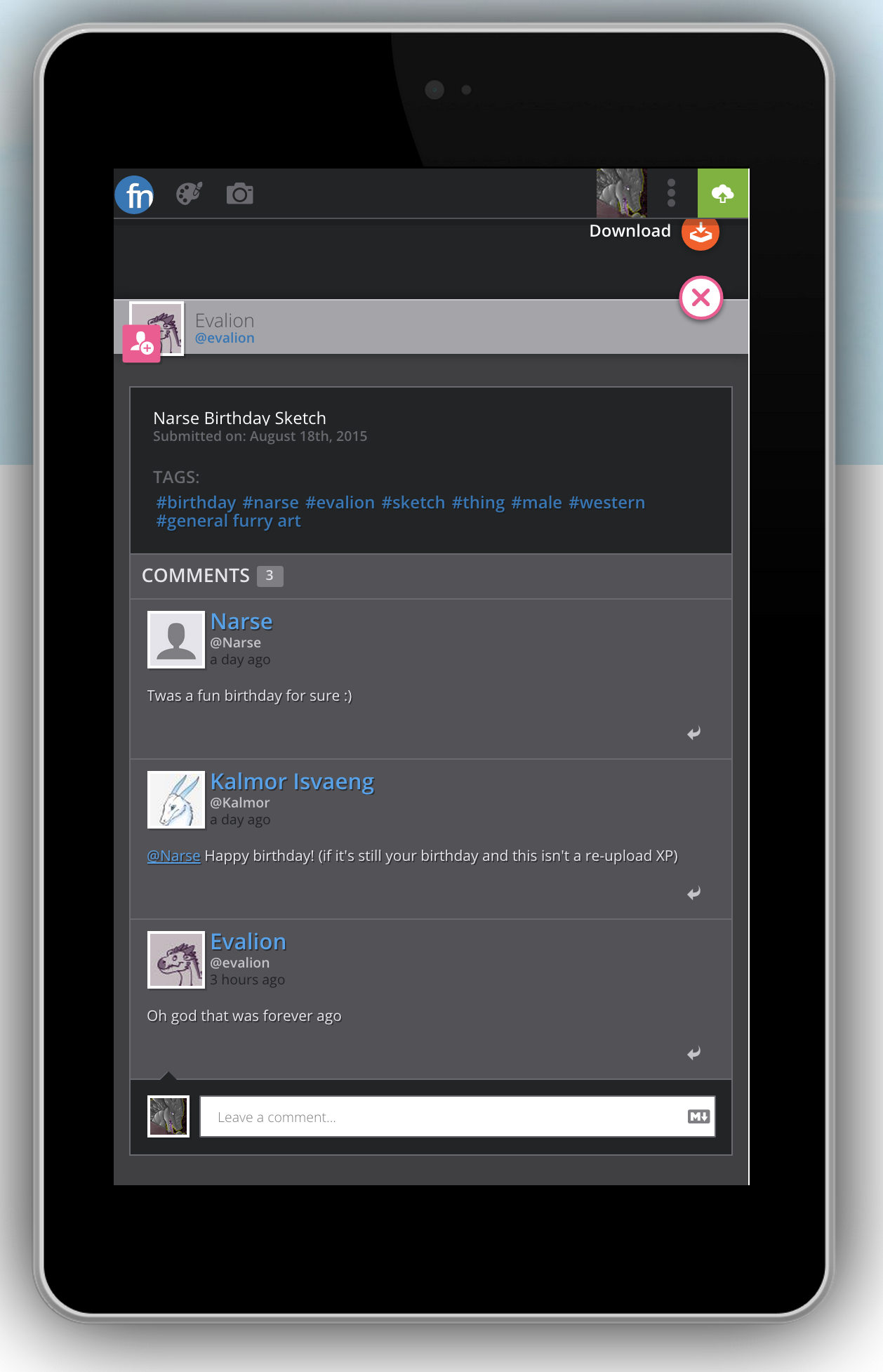
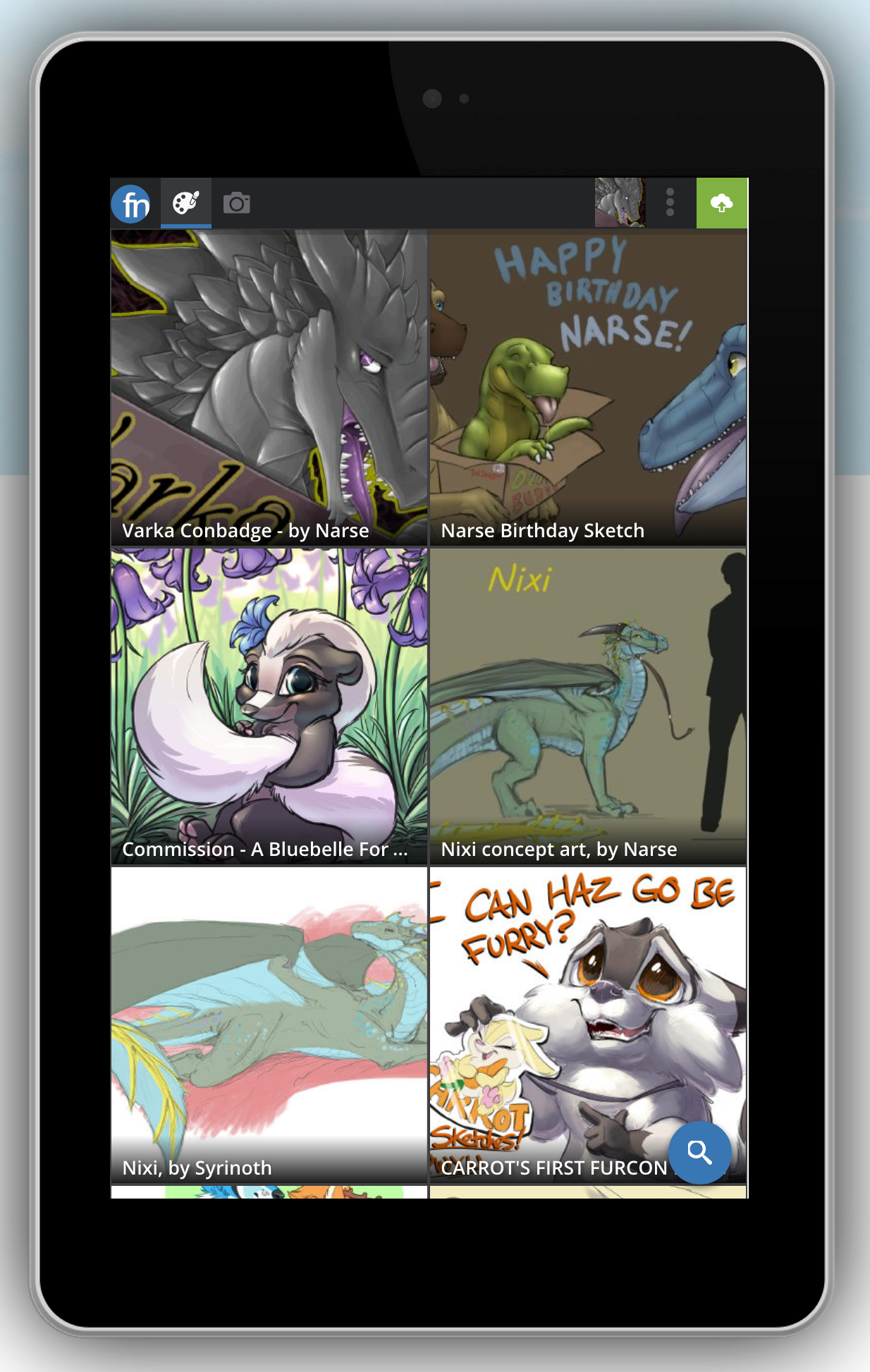
It even automatically resizes when you rotate your tablet:
We are very excited for the opportunities this presents – not only can you browse wherever and whenever you like, but you’ll get the same fast, responsive, full-featured experience regardless of where you choose to use it. Oh – and you don’t get kicked off if you switch devices. You can stay logged into the site from multiple devices for as long as you like – no buttons to push, no options to set.
Got a mobile device handy? Visit the site here and try it for yourself!

– Varka and the Furry Network team
 Furry Network Blog